Friday, October 28, 2011

Shiet iPhone Flash

Update on where the 816 touch points stand. These aren't all of them but just some of the ones I had ready to take a picture of. The others include a web page, shirt, van, sound clip, etc.

Sorry about the photo being so awful. Party.


More than a Mixtape


When considering the direction for the final chapter of my senior year in the graphic design department I want to choose something that doesn’t fall short of where I’d like to be and what I am passionate about. Two things that immediately come to mind are graphic design and music. With these two things I plan to answer the question: How can I use graphic design to express and harmonize music lovers and people who understand the effect of music on the human mind and body?

When making the decision to choose the topic of music, I am planning on doing a project that brings together music lovers and exploring the mental effects music can have on a person. Anyone that has ever heard a song and really get it is considered part of my audience. Exploring this x factor of music and creating print media is very important to mirror the feeling of music and how close it can be. Maybe these printed things will become gifts like mix tapes or music videos or motion projects. 

Monday, October 24, 2011

Ivanhoe Branding

Ian, Karen and I have taken our feedback from people in the Ivanhoe Community and are starting to form new marks for their logo.

I took the house that was suggest to be placed somewhere in the mark and created an icon based on the only sign that Ivanhoe has signifying their community.


Gratuitous


Jak Hornblow told me, "Mm I think it's gratuitous."
Thanks, Jak. I agree.

Business Cards


Thursday, October 20, 2011

Ivanhoe Presentations

This presentation was to explains the proposal of Karen, Ian, and I's direction for intervention in Ivanhoe.
Ivanhoe Logo

This presentation was made to help explain the process for introducing and getting feedback from those in the community.
Strengthening Ivanhoe Keynote Copy

App Icon Making

Made some icons for the "Culture Shock" application.

Monday, October 17, 2011

NY Times Readings

For the first article, I was interested in the notion of having apps and sharing convinced down to the minimal amount of buttons and choices. I'm not easily impressed by apps that can do everything. Even if they are able to do a copious amount of work, all the buttons and options are super overwhelming for me.  My OCD kicks in and I find my time focusing more on the personal settings and what everything in my account history still exists and what I should edit or delete than actually using the application.

The thing that really sparks interactivity with these application is when they are embedded with imagination. Interacting with an app can be as simple as flipping a page like a book or as exciting as using it like a wheel of a car for a game.

As you can imagine, most of the more creative apps are the ones designed for the younger users that features stimulated teaching games and games that are just for fun. So how the hell do I design something for adults and young adults that will be informative and still create a memorable reaction? Hm.

816 Recording Cont.

Here's some more pieces about how this thing is going to come together.


Updated Screens

Hub


iPad Weather


iPhone Medicine


Saturday, October 15, 2011

Screen Space by Helfand

Space and time. Sounds like the beginning of a very long discussion in a circle full of stoners. Reading further down, Dematerialization of Screen Space starts with the topic of just that – space and time.

With the invention of the computer, the light and the speed it moves at stares at us, as users, right in the face. We use this light and energy to look up the weather, do homework, and watch DVDs. How each of these spaces is designed correlates to how the actual "space" is represented.

How often do we look at the screen and not realize that it's not just a composed of click click. This click click can also be thought of as many layers. Oh man! The way Helfand puts it is, "What has not been recognized is the extent to which the viewer is a moving target. Are our conceptions of electronic space lodged in geometric exactitude in an effort to harness the dynamic of an unruly audience?" Oh man, I like that.

Friday, October 14, 2011

Inspiration

Culture Shock Group

Seaching images on both flickr and google under "culture shock" isn't as easy as you'd like. Apparently culture shock is a dancing, hula hooping group. Who would have thought?

Thursday, October 13, 2011

Visualizing 2D Planes in 3D

Look I made another 3D model. This model refers to how the community feed information and receives information from the hub. The little twisted pieces of paper represent the three types of users (parents, students from the UK, and students from the US). Once these users gather information from the hub they also get information that they've dispensed and extracted all mixed around and knotted with other information. This forms a web, keeping the content of the "held space" growing and changing for each of the users.


MX Hub and Login Screens


iPhone Wireframe for Medicine Application

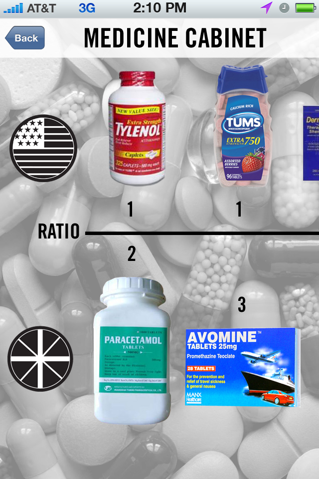
Through the use of an iPhone application, students studying abroad can now easily found out where to get medicines and what their equivalent over the counter prescription is. Party!