Wednesday, February 29, 2012
Tuesday, February 28, 2012
Friday, February 17, 2012
Inner Oasis
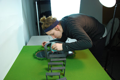
In Kelsey and I's final monument we decided to call it "Inner Oasis" the name compliments the space that our monument has to offer. It also refers to the feeling that one will may receive as they walk through the arches.
These arches are small and grow as the "journey" is made through to the final room.
Labels:
Inner Oasis,
Monument,
Spatial Experience
Saturday, February 11, 2012
Coding Rap
Just a little inspiration and a track if you're running out of songs to help you through all your coding sorrows. Oh sweet Jesus.
Yepp, lol.
Labels:
Coding,
Inspiration,
Music,
Video
Wednesday, February 8, 2012
Change in Spatial Monument
Kelsey and I have decided to change directions for our monument. We feel that this monument has a more direct route for viewers to be lead through. This "cleansing process" will take place at the narrower end of the structure so the viewer will feel the space getting larger and more comfortable around them while they walk through it.
Chimes and birds will be heard when people are walking through the structure to slow heart rates, and clear minds of anything that might relate to their stress. This therapeutic noise promotes a slower pace and a sense of clarity.
Once the viewer makes it to the end of the structure, they will be in the final reflection room. This room will be at a symbol of inner and outer piece. This is reflected with the encompassing circle shape but still hints at the world and atmosphere around them due to the windows in the side of the building. These windows are the same shape as the "tunnel of arches" to the final room.
After viewers walk outside of the reflection room, they will be met by two reflection pools on both sides of the path, which leads back out into the city. The extra area of space is a place where people and families can come and play or just spend some time together. Our memorial works as a "detox" but also ais in the message it carries, which is - slow down and take advantage of the things that really matter - (i.e. families, culture, weather, grass, free time, etc.)
Labels:
collaborative,
Monument,
Spatial Experience
Sunday, January 29, 2012
Thursday, January 26, 2012
Building a Monument
For the first Spacial Experience project, Kelsey Anderson and I have decided to develope a monument that poetically reflects it's viewers and audience to the slow movement. This movement is intended to slow people down and it is an ode to the lost cultures, languages, connections, and time people lose do to increase speeds from technology, etc.
We have decided to put our location somewhere that is busy. Dubai is a quickly growing, very busy city.
We have decided to put our location somewhere that is busy. Dubai is a quickly growing, very busy city.
Characteristics of this monument:
- Quiet
- Clean
- Slow
- Connective
- A space for a small amount of people
- A strong, outdoor structure
- Somewhere in its own nature
Monday, January 23, 2012
To Infinity and Beyond
When considering where I want to be, how I want to get there, and what kind of life I want to live there are so many strategies that loop around in my head in order to become the person I am learning to become. The best shot I have at getting anywhere is taking chances and [as cliche as it sounds] following my heart. Let me explain:
Here's my checklist (which also has room for adding and subtracting characteristics):
[ ] People that are creative
[ ] A climate that either has definite seasons or beautiful weather
[ ] A company that values new and innovative ideas
[ ] Collaborative groups
[ ] I want to know my colleges on a name to name basis
[ ] I don't mind working for small or large clients
[ ] I want to work hard and be able to live comfortably
[ ] I know that I want to work in a firm with people that like what I like (more or less)
[ ] A firm that is interested in helping the same audiences as myself
[ ] A firm that knows there is a future and isn't always looking at the past
Career goals and strategy for getting there is hard work. Being social and making connections that was helps too. Once I complete my website, portfolio, and updating my resume (which I am in the process in right now), I will study firms that fit the following checklist above. Also, location doesn't tie me down at all. I have an idea of where I want to head but it's the type of people that I will be working for and the type of people that make up the community that I would be living in that matter to me.
Bottom line: I'm willing to give 110% to live and work somewhere that fits me – and I fit them.
Labels:
Pro Practice,
Reflection
Location:
Kansas City Art Institue Design Building
Sunday, December 4, 2011
Senior Presenation
Holy shit! I'm almost done with one semester and have one more to go in my college career. For this presentation, I wanted to my audience to take a look at who I was and where I want to go after I'm done with college. Yeesh! Getting a bit nervous just thinking about it.
Senior Presentation
Senior Presentation
Labels:
Presentation,
Senior Presentation,
Senior Project
Wednesday, November 30, 2011
Tuesday, November 29, 2011
Friday, November 25, 2011
Monday, November 21, 2011
Interesting Portfolio Sites
I enjoy how this site plays with scale for importance of work. Seeing large scale pictures make it simple to scroll through and ready about the project in smaller groups of title text and can choose to learn more about it by clicking on the picture. As you scroll, more work pops up which doesn't seem to be very solid and seems kind of overwhelming. The beginning idea is there about adding interaction and surprise to scrolling, to the site, but I don't think it's quite there yet.
jasonmunn.com
jasonmunn.com
Links and type is limited. Some would say this is boring but it leads you to look straight at the work.
All of the interaction on this site is really fun to move around on. Even with a large amount of rollovers, the work still is notable when rolled over.
I dont remember who's site this is but the way to display the portfolio pieces is interesting. I wish I was better at illustration.
Saturday, November 19, 2011
Friday, November 18, 2011
Senior Degree Project
I have set up another linked blog that will take you through the steps and process of my Senior Degree Project. This is a very important project to me that I have confidence in nothing short of an amazing result. If you're interested, links, posts, pictures, and process can be found here. Oddly enough, the web address of seniordegreeproject2012 was not taken [so, I nabbed it].
Tuesday, November 15, 2011
Wednesday, November 9, 2011
Tuesday, November 1, 2011
Monday, October 31, 2011
Design Phase III
Upon completing the touch points for 816 Recording, I began to really put this company into context. The design elements I used started to "family up" and come together to start to really create a system.
816 Recording is meant to reflect 3 main attributes. These 3 words are modern, elegant, and timeless. This company also has a lot of power meaning that the item that they have for sale isn't just another product – it's a life change. It's a step towards becoming who you want to be and going where you want to go. And, it's about passion.
At 816 Recording we believe it's time to give it all you've got and to let us hope you get "Your Piece of the Sky".
[Julie] Phase 3
Labels:
816 Recording,
Design Systems,
Presentation,
Rebranding
Friday, October 28, 2011
Subscribe to:
Comments (Atom)


